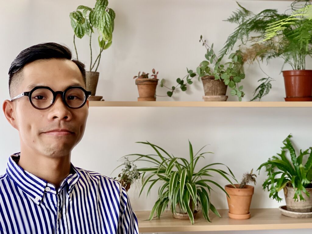
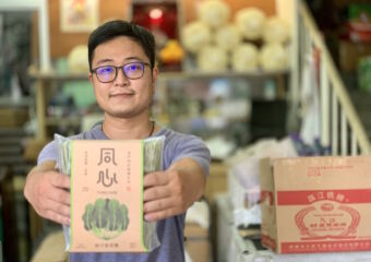
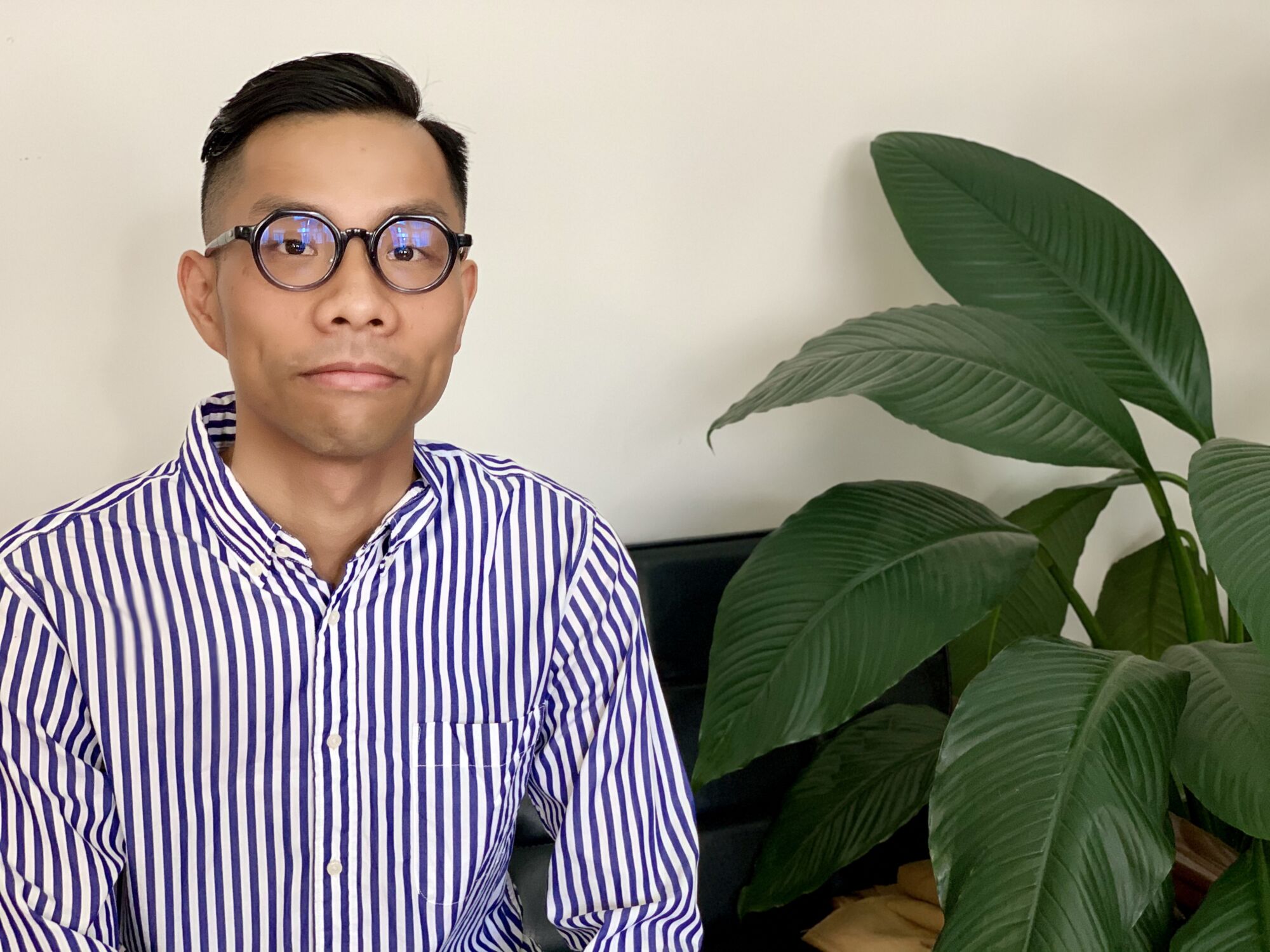
Kenneth Ho is the founder of local branding and rebranding company, WWAVE Design. With a slick, super modern, and minimalist approach to brands and visuals, Kenneth has been climbing his way to the top. After graduating from the Macao Polytechnic Institute, the designer traveled to New York. The “Big Apple” amplified his knowledge where while he was visiting the city, he also studied and work there. 2004 was the stepping stone for its current success, the year he opened his very own business at the age of 26. Besides lots of local jobs, he’s also been landing regional and international ones, as well as collaborations. Illustrators from Hong Kong and other local artists have been working with Kenneth Ho on making brands more beautiful and attractive. Because sometimes, all they need is a fresh new face.
Tell us a bit about yourself and what you’re currently doing.
I’m a branding and packaging designer and I mostly work on commercial projects. Recently, I’ve been involved in projects regarding the revitalization of old shops in Macau.
That’s interesting! What does it entail?
I was invited to participate in several workshops where I talk about my experience doing this. It’s actually a subsidy project, funded by the (Macau) government, focusing on the community and cultural industries. The goal is to revitalize these traditional businesses. There’s a shop called Cheong Kei that produces and also sells noodles. This shop is old and didn’t really have a lot of branding, to begin with; on the other hand, the local market of dried noodles is quite saturated as well.
The idea was to make it attractive to even have them exported overseas and make them look better in the local market. One of the interesting things about it is that the Chinese characters mean these are “noodles for our neighbors”, which means it’s something you share with people who are close to you–it’s a local thing. The concept is also linked to the product being affordable, staple food, a necessity food. They want noodles to be as common as rice.
Cheong Kei now has the family’s second generation on board as well: the son of the couple that owns the shop is educated and decided to return to the business to help out. They haven’t raised the price for five years, since 2016, until now. Funny enough, the price is still double the noodles sold in Hong Kong or China. Also the packaging wasn’t as attractive nor enticing as the ones from Hong Kong brands. It’s not competitive.
I then started thinking about this and what to do. Three aspects were on my mind: 1) why does this shop need to be redesigned? 2) the branding isn’t clear nor sharp 3) the packaging doesn’t reflect the core values of the product itself.
So what was your role in this?
One of their core values is quality. That when they make the noodles, quality comes first. The father even says that he’ll only make noodles he’ll allow his son to eat (laughs). This was the concept. They wanted the package to show persistence regarding quality; they have variations other than the classic shrimp roe noodles, like spinach–which only has flour, water, and spinach, no artificial ingredients. Actually, it was the son who introduced these variations as there were no health-conscious products before.
They started redeveloping the brand this way. The shrimp roe ones have the character meaning “joining hearts”, because it was something they offered to the guests during his son’s wedding, as a symbol and gesture of appreciation and love for friends and family. It’s kind of a family tradition, there’s a narrative behind it.
When it comes to the old packaging, it lacked temperature in the form of color. We also have to consider the kind of packaging we produce, the design we came up with shouldn’t be complicated because the mother’s the one putting the package together. I decided to just create a sleeve to get the original package inside so they didn’t have to revamp the whole thing. We also wanted to establish a visual memory for this, like Pepsi–blue and red–Coca-Cola (red), while others like Bonaqua or others also have distinctive visual characteristics. We then used the colors of the ingredients: orange for the shrimp roe, green for the spinach, and so on. We also added the story of this business on the back of the sleeve, so people can know more. The owners also have specific ways to cook these noodles and we’ve included this on the packaging as well (laughs).
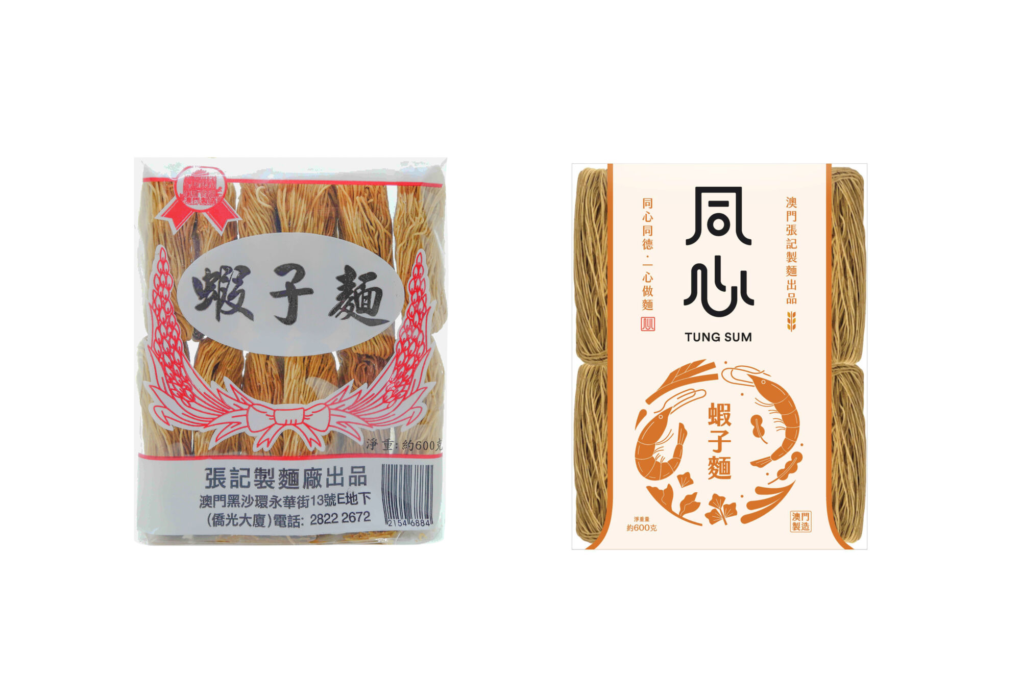
Old vs new packagings (left to right). Cheong Kei noodle’s rebranding project, by WWAVE Design, Kenneth Ho
You graduated from the Macao Polytechnic Institute. Were you always fascinated by design or just when you applied to college?
I became fascinated the moment I first learned about it. I was around 15 or 16, it was after I joined a summer camp organized by IPM.
What are your first memories when it comes to this craft?
I used to love drawing, ever since primary school. I drew a lot, it was kind of my hobby at the time. However, when I was in junior high, my family influenced my opinion–that being an artist doesn’t make money–so I didn’t really engage in drawing anymore. The casinos started booming when I was a teen, so I applied for the qualification exams to become a dealer in the casino. Yet, that summer camp really made me understand I could be something else rather than a dealer at the casino.
Regarding design, what are your main rules when it comes to a design project?
At this stage of my life, my design philosophy is focused on sustainability and longevity of my designs–I prefer it to have a longer life span. Secondly, I care about simplicity.
How’s a typical day for you as the founder of your own design company?
I mostly direct projects and assign tasks to people; since this is a small company, there’s lots of communication involved and my other task is to push our designers to go further and try multiple design ideas. Right now, our workload has reduced a bit so we actually have more time to spend time discussing each project carefully. We’re a local company, but we also do quite a lot of overseas projects.
Did you create the company because you felt the market lacked something like WWAVE Design?
After graduating, I noticed there were quite a few design firms and companies in Macau, even the one I dreamed about working in. I eventually got a job somewhere else, where I mainly worked with marketing projects. That job got me enough money to be able to travel to New York, where I studied and even worked a bit. I experienced living there for six months. Upon returning to Macau, I opened my own company and felt, very clearly, that I didn’t want to work for someone anymore.
You mainly work with branding, rebranding, and packaging design. How does this work in practical terms?
Luckily, there are always people connecting and looking to work with us. And I’m glad because I’m not very active in the search for clients or collaborations (laughs). There are two ways: recommendations amongst clients and people that approach us after seeing our work on social media, which are usually overseas clients that contact us online.
We also do collaborations; for example for the revitalization of the old shop, the illustrations were created by a local illustration artist. We also have projects with other local illustrators, also from Taiwan and Hong Kong. This makes us versatile in a way since we work with different people all the time.
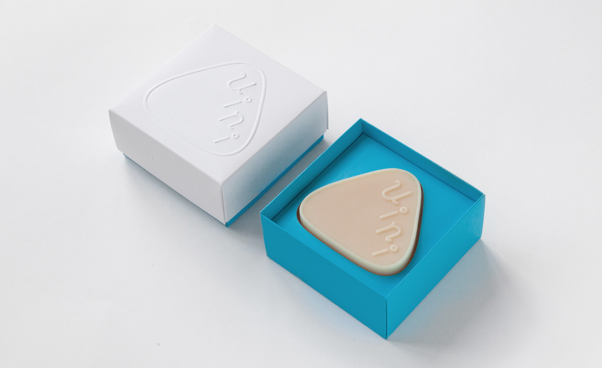
Uini Soap. Product and packing design by WWAVE Design.
What’s the most memorable project you worked on?
A memorable one is a brand of handmade soap, called Uini Soap. The interesting part was that I started brainstorming and the first thing I thought about was the soap’s shape. Often times, you notice the packaging isn’t very connected to the product itself; what we wanted to do was engage in the process of thinking about the shape and the product so it could stand out amongst its competitors.
Usually, with soaps, you see that the brand’s name or logo is stamped upon the soap which is concave, however, in our design, it’s the contrary. The soap makers would say “No one does that, we just press the patterns into the soap”, because the areas are so fragile it usually wears off quickly. However, I insisted on the idea. During the process, starting from the shape of the product, you can see it’s triangular, instead of what one commonly sees: square or circular. This way, it’s easier to hold and it doesn’t slip from our hands that easily–it’s not so slippery like with the round-shaped soaps. This is the shape I find friendlier.
Is this a local brand?
Yes! In fact, my girlfriend’s the soap’s creator and I also helped in the product’s positioning.
Where is it sold?
At The Grey Green, close to New Yaohan. We chose The Grey Green for two reasons: they also sell flowers and there’s a similar philosophy regarding the nature of the products; also because it’s more consistent with the atmosphere of consumption we’re looking for. The price of the soap is a bit higher than other brands sold at the supermarket and it won’t be so competitive if we start putting them out there as well.
What, in Macau, do you think it’s an outstanding example of good design?
Can I say a person or a company? (laughs)
Yes, sure!
MO Design–they’re the ones behind The Grey Green, as well as other businesses. I used to work for them when I was in college. They’ve helped me to think for myself and use my creativity. It’s not very common in Macau or anywhere else for that matter.
Do you know a secret spot in Macau that showcases great design features?
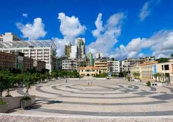
There’s a shop called About Good Life, close to Tap Seac Square. The shop’s owned by a designer and a lettering designer as well, it’s quite special. They also organize various making workshops regarding ceramics, wood, and more.
Macau is your hometown, right? Do you live here?
Yes, very much. Maybe due to the recently reduced number of tourists, life became easier, less stressful, and packed. Recently, I’ve been engaging in some projects with the hospitality industry, like with Grand Lisboa when it comes to packaging. They used to have some I didn’t find visually very attractive. I’m assigned for a project regarding their mooncakes’ packaging. When I was doing research and checking photos, I noticed some angles were really nice. I discovered that it has its moments of beauty. Why am I mentioning this case? Because it kind of resonates on the way I feel about Macau. I used to think it wasn’t that pleasant and that it was an ugly city. However, I started looking at the city as other people did and discovered its beauty as well.
Take the Ruins of St. Paul’s, for example. I don’t usually go there because it’s always so crowded and packed, but that doesn’t mean I hate it. What we’re now lacking in Macau is time to rediscover the city itself.
Do you miss Macau from your childhood?
I do, yes. However, I gotta say the most memorable parts of Macau were always the areas I actually grew up in; I didn’t know Macau that well after all. It’s now, as an adult, that I start understanding more and more about Macau. I can say I miss the old Macau, but I also like the feeling of getting to know it in my adulthood.
Where do you like spending time when you’re not working?
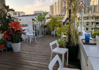
Swimming, going to nice coffee shops, like Quarter Square, and I also love visiting some of the traditional shops in Macau, like in Rua do Cunha, Taipa Village.
Where do you take your friends that are visiting Macau?
Usually to eat out, to places I like to eat at. I like taking them and show them more down to earth places.
Also A-Má Temple and touristic places?
Not, really, they already know their way around those (laughs). I also like taking them to Pin-to Livros e Música bookshop.
Follow Kenneth Ho and Wwave Design’s work through their Facebook page and also their Instagram @wwave.design
Wwave Design Rua de Francisco Xavier Pereira, no.137-145, Ind. Pou Fung, 10-Andar-A, Room C1, +853 2825 2879, www.facebook.com/wwavedesignltd

